
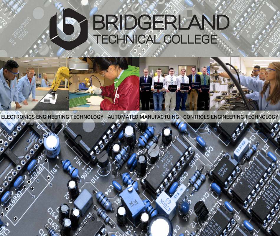
I would really like some feedback on this. This design has two purposes, first it will be a mouse pad, and second, I should be able to cut some of the top and bottom off so that it can be the background on all of our student computers in our department. I'll need to have at least two different resolutions to fit each computer. One of the first things that became apparent very quickly was that without the white bars, the whole thing felt too busy. The picture with the boys holding their certificates was also a challenge due to the background. I tried removing the background behind the boys and replace it with something else, but everything I tried just looked out of place with the rest of the mouse pad, so I redid the selection and blurred the background quite a bit to give it more of a depth of field look. The original pictures on the right and left had a bit of a haze to them so I adjusted that part. I also like how the background turned out overall with the squares and color/gradient overlays.
I kept messing around with this, and thought I'd give this version a try. Which one do you like the best? I tried a hue blending mode over the opt of the circuit board using the same blue that is in the lab coats of the students. I think it turned out pretty cool.
